What is Responsive Website Design and Why Should You be Using it?
 Paul Marshall
 5 minutes read


Responsive website design is, or at least it should be, the death of having to have two separate sites, one for mobile devices and one for desktops.
When the mobile revolution began as smart phones began sprouting from every electronics manufacturer going, to handle this new phenomenon, detection scripts were added to sites to send mobile users to some half baked, usually out of date and massively feature less facsimile of the main site, just so it would fit on their screen.The situation became even worse with the introduction of tablets and massive smart TVs that have internet connections. To try and keep up with the current dizzying array of sizes and resolutions that are already on the market, not to mention trying to future proof your site with a fixed column layout, is nothing short of impossible.
The solution
Responsive web design takes advantage of the modern browsers on these smart devices (without prohibiting those on older browsers/machines from using the website) and gives the browser enhancement instructions on the styling, dependent on the screen real estate available.
The majority of modern responsive frameworks, the code that creates the code that styles the pages, have a mobile first setup. This includes one that Twitter themselves came up with and made freely available for people to use on their websites to really make the mobile revolution for all easier – http://twitter.github.io/bootstrap/ Basically what that means is you start off by designing the site based upon a screen resolution around 320 pixels wide and 480 pixels high. This way of designing really allows you to focus on the layout of content from top to bottom, so you consider very early in the design process where navigation lives, how soon you want your calls to action to occur, what’s key to tell your visitor and what can be moved into a closed menu or hidden completely as it’s unlikely to be relevant for the mobile user.
As the screen viewing the site increases, iPad mini, iPad, Desktop etc there’s trigger points in the code, where the designer can say ‘Ok, at this point, one column is too wide here, there’s enough room to switch the design to two, bring the content further up the page keeping everything still legible and readable’. It gives the designer an infinite amount of flexibility so your end user feels loved and considered, and regardless of what device they’ve arrived on your site using, they get your message as you intended it to be displayed, not just what’ll fit.
It sounds brilliant! Like the Swiss army knife of web design! But is it for us?
If you’re B2B you might think it’s unlikely that your current users will be using all these new bits of tech to view your site, you might even have access to your Google Analytics that backs this up, but how long will that last for? Building a website now that doesn’t take in to consideration that future users will be accessing it on a multitude on devices with a multitude of resolutions means it’s falling behind in user experience, not only compared to your competitors, but compared to the experience users will have when it comes to their experience on B2C sites.
38% of email is now opened on a mobile device according to Hubspot and personally, I hate landing on a site that requires me to start pinching and zooming on my iPhone or iPad to see what’s actually written on the page, and I’ve even greater contempt for those that still redirect me to the mobile ‘lite’ version, where half the features, usually the one I wanted to use, have disappeared completely.
Is it expensive?
So we’ve done the ‘can you afford not to’, what about the ‘can you afford to’? Conceptually, the designer is going to have to think beyond the usual desktop layout, and take time to make considerations for their design at these lower resolutions, and in turn the additional design ‘breaks’ in the code will need to be added, so you’re likely to be paying for that extra time. However, to manage this extra code, frameworks of pre-processor scripts to instruct a program to create/output the final styling code for the designer are employed.
What’s fantastic about this is the developer can hierarchically create styling in a separate set of files that are organised and clear to maintain and expand. You can easily make sweeping changes to a sites styles and layout just by changing small amounts of referenced code, which previously would have been a real time consuming headache. So whilst the initial outlay might be higher, this way of working affords swifter and easier changes and additions to the site without everything becoming a huge mess of spaghetti code as the site inevitably grows with content.
Here at Axon Garside, we’ve really simplified the design process when it comes to presenting layouts in their various responsive states.
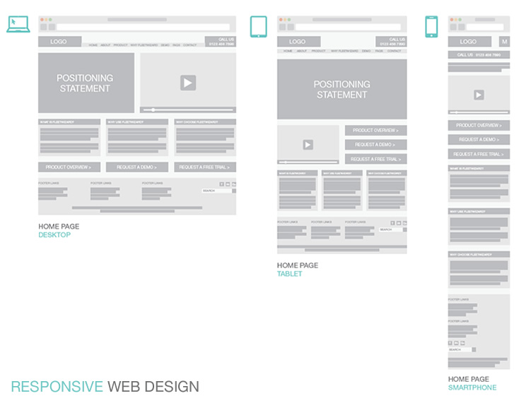
It allows both the client and the developer to interpret the full size design in its new reduced size format without having to create and add on the cost of complete visuals for each step.