4 ways to optimise your calls-to-action to improve B2B lead generation
 Spencer Montagu
 5 minutes read


Like many thing within marketing, creating calls-to-action (CTA) that deliver successful B2B lead generation results is both an art and a science.
Why?
You'll need all of your (or your agency's) creative flair to produce CTAs that attract people with compelling copy and eye-catching design. At the same time, you will also need good data on page views and clicks. Having this data gives you the scope to tweak and amend CTAs until you crack it and the conversion rates really soar.
We'd argue that the perfect call-to-action doesn't exist. Creating CTAs should be an ongoing, iterative process. Don't spend days crafting an elaborate CTA for your latest free download - create an initial draft and then A/B test different versions of it. Change one element at a time (colour, location on the page, button text, etc.) and measure the results.
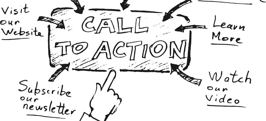
Start by learning the basics of a good CTA. You need concise copy that entices the viewer, but doesn't over-sell the offer (including on the CTA button), a simple and effective design that stands out and the best possible location (it could be above or below the fold).
The problem is that such broad parameters leave a lot of room for variation and this can be confusing, particularly if you're a newcomer to digital B2B lead generation. When we look at HubSpot's 39 call-to-action examples you can't help but click, it's obvious that the style and content of the Evernote CTA is very different to the Pinterest CTA, for example. Is it possible to be more specific about the qualities shared by the best-performing calls to action?
We analysed the 39 outstanding examples highlighted by HubSpot in greater depth to identify four things that (more or less) all of them do to drive clicks. Follow this lead and you'll soon have your B2B lead generation engine firing on all cylinders.
1. Make sure people can't miss it
It seems obvious, but it's surprising how many CTAs just don't grab the visitor's attention. Of course, people will see one when they know what they're looking for, but you need to create something that will engage the most casual web visitor.
Making a CTA unmissable doesn't necessarily mean bright, contrasting colours and large buttons. You can also command attention with simple copy and clean, incisive messaging.
Huemor's example is a perfect representation this. Clean, bold text and a single button. They even go one further by playful teasing you not press the CTA.

2. Make them think they'll be missing out
Making people feel that they will be missing out if they don't download your offer, also known as the bandwagon effect, is an easy and incredibly effective way to make your offer seem valuable - and encourage people to click.

If you can make people feel like they'll miss out on something by not clicking, you'll find your conversion rates go through the roof. This is what the Apps Templates CTA selected by HubSpot does with its invitation to 'join the club now', and this CTA for our client Kahootz works on a similar premise:

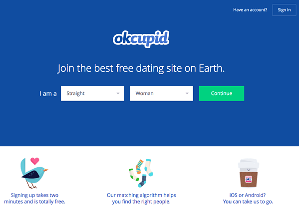
3. Make it feel easy
Very few people arrive on a website with the intention of clicking a CTA and share their contact details. They're much more likely to complete this process if they think it will be quick and easy. A lot still depends on your landing page and form, but your CTA can set the tone. Think carefully about the words on the button - will they create an expectation of speed and simplicity in the visitor's mind, or suggest a convoluted process they don't really have time for?
The OKCupid CTA is a perfect example. With sections of the form already filled in and the word 'continue' on the button, it skilfully creates the impression of a quick and hassle-free sign-up process.

If you want proof of the efficacy of this simple format, they're still using a variation of it now 3 year later. In fact, they've doubled-down and really highlighted the simplicity and convenience of the process using iconography beneath.
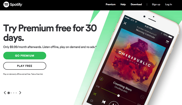
4. Give them options (if possible)
It might seem counter-intuitive to provide two options on a CTA. After all, aren't you trying to encourage people to take a specific action? However, offering a choice can pay off - particularly when placing prominent CTAs on your homepage. Not everyone is at the same stage of the buying journey when they reach your site, so it could make sense to offer a free trial and a chance to learn more side by side.
The Spotify example below perfect this.
Providing a free-trial for their premium service alongside the freeware version of the software. Aware that once someone is in the Spotify ecosystem it will be much easier to retain them or convert them to a premium customer.
Effective calls-to-action are only a small part of a successful lead generation strategy. Find out how you can bring all the elements together and turn your B2B website into the ultimate lead generation tool. Read our guide 'Everything you need to know about optimising your B2B website for lead generation' now.
This blog was originally published in March 2015, updated in June 2017 and once more in October 2020 to provide a more accurate reflection of current trends.