


If you're going to turn your website into a B2B lead generation hub, learning how to create effective calls-to-action (CTAs) is essential. A good CTA will compel your visitors to click, complete a landing page form and share their contact details in exchange for an offer; a poor CTA is likely to be skimmed over, ignored or missed entirely. The best calls-to-action for B2B lead generation include:
- Enticing copy
- Eye-catching design
- The right placement
- Continuous improvement
This is why it's important for anyone who is putting together a B2B lead generation strategy to take the time to create truly compelling CTAs, as well as great content and persuasive landing pages. There is no magic formula behind the best-performing CTAs. Much will depend on your audience and the type of the content you're offering.
Remember to treat the use of CTAs on your website as an iterative process and test different versions and types to see which ones work best.
That being said, here are a four examples of CTA creation that are considered best practice that can help you get started.
Enticing copy
The copy on your CTAs is arguably the most powerful tool you have to convince visitors to click. You need to create a sense of trust, urgency and value with the words you use. At the same time, you must keep it fairly brief - a wordy CTA is unlikely to inspire action.
Be careful not to over-promise with the wording of your CTA. Of course, you want visitors to click, but you don't want them to be disappointed when they reach the landing page to download your content. Make sure the words on your CTA accurately reflect the offer being promoted (As you can probably gather, it's difficult to create a brilliant CTA without some exceptional content behind it).
Here's an example from Lloyd's British:

Example 1: CTAs should include compelling copy that sells the value of your offer.
Finally, don't forget to be creative with the wording on your form buttons. 'Submit' is boring, over-used and could put a prospective lead off. Again, you can use the button text to convey value and urgency, such as 'Download now' or 'Get your free trial'.
Here's an example from British Red Cross First Aid Training:
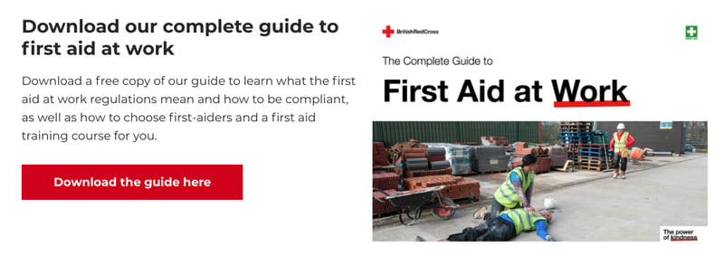
Example 2: Use words other than 'Submit' on your form buttons
Eye-catching design
Design-wise, your most important consideration when creating a CTA should simply be: how do I make it stand out? Avoid using a similar colour to the background of your website or blog pages. It's important to resist any temptation to design CTAs in a way that is sympathetic to the overall design of your website - you need them to grab people's attention, not blend in and become just another element on the page. Try injecting pops of colour to catch the attention of your visitors.
The right placement
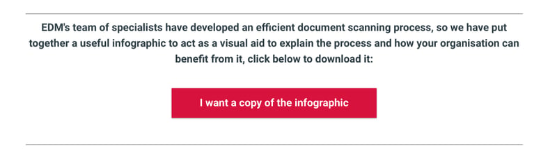
So you've written some concise-but-compelling copy and placed it within an unmissable design, but the work doesn't stop there. You need to think carefully about where to place your CTAs, as finding the best location will greatly increase the click-through rate. Another thing to consider is the type of CTA you use on your blogs. Try using a combination of image CTAs and in-line CTAs at different points in your blog to break up the copy. If you have a long blog post, it's likely that not everyone will make it to the bottom of your post, so try adding a CTA halfway down to capture visitors.
A CTA is worthless if nobody sees it, so make sure you place them above and below 'the fold' and on your most popular website pages. However, avoid using too many CTAs on a single page, as firing out several messages at once will only confuse and frustrate your visitors.
Here's an example from EDM:
Continuous improvement
As we mentioned, building CTAs should be an ongoing process that requires constant review. Even great CTAs can become stale quickly, so monitor views, click-through rates and submissions carefully and try an alternative when performance seems to be tailing off. You're unlikely to get it right first time, but willingness to experiment and plenty of A/B testing should help you improve your lead generation results. Remember to test one aspect at a time, so the results of what's working and what's not, are as clear as possible.


.png?width=115&height=183&name=sade%201%20(1).png)