

The conversation around accessible website design is gaining a great deal of traction in the design, tech and marketing industries at the minute. We’re seeing huge players investing significant time and money into ensuring their websites and digital products are as accessible as they can be. But contrary to popular opinion, accessibility isn’t just a new ‘fad’ exclusive to the tech giants or public sector.
Technology continues to be an integral part of our lives, and as more and more people move online to conduct their business,accessible website design is something that all businesses need to be thinking about. Especially in the context of the past year, it’s becoming increasingly unacceptable to have a site that doesn’t work for its users.
That being said, getting started with web accessibility can be daunting. But don’t worry - you don’t necessarily have to do a complete overhaul of your entire website. We’ve outlined 5 ways you can improve accessibility on your B2B website right now.
What does web accessibility mean?
Accessibility (or the ability to access) is used to inform the design of services, devices and products so that they can be used by people of all abilities, backgrounds, ages and knowledge levels.
Accessible website design focuses on designing and developing websites and digital products that achieve this goal. But not just people - technology, too. Web content must also work across a range of mobile devices, assistive technologies and browsers in order to be seen as truly accessible.
Web accessibility is achieved when your site meets the 4 principles of accessibility.
What are the web accessibility principles?
The Web Content Accessibility Guidelines is a widely used accessibility standard for web content. However, since this can be quite a lot to go through at once, let’s simplify the concept.
To be accessible, web content must apply 4 key principles:
- Perceivable
Your users should be able to recognise, access and use your site content with the senses they have available. Some people may have visual impairments or other health issues that impact their use of the web, and your site shouldn’t ignore this.
- Operable
You need to ensure that users can find and use your web content, regardless of how they choose to access it. For example, users may choose to access your site on a mobile, or by using assistive technology. It’s essential that your site is accessible via multiple devices.
- Understandable
This is key for all users; after all, if they can’t understand your site or content, how will you ever secure their business?
Your site must be understandable for all users. This means doing things like using plain English, avoiding unnecessary jargon, and making sure that features (forms, CTAs, links) are communicated clearly, and don’t attempt to “trick” your users.
- Robust
Lastly, for your website to be accessible it must be able to be interpreted and used by a range of different devices and channels - such as outdated browsers, or assistive technologies. This means doing things like ensuring that you use valid HTML across your site, and avoiding the use of PDFs where possible.
Applying the principles of web accessibility
Each of these 4 principles must be met for your website to be accessible. At this point, you’re probably thinking, ‘wow, that’s a lot’. It is.
Web accessibility as a principle has grown substantially, and following the impact of Covid-19, has been thrust to the forefront of most discussions about designing products and services for the web.
Covid-19 saw an influx of new users online, many of which were navigating the digital space for the first time. And while these users (typically older) may not seem relevant to your business specifically, Covid-19 has shown in the starkest light that many websites simply don’t work for their users.
Accessible website design is arguably no longer something you can ignore - even in the B2B space. Now more than ever, even the most experienced users are demanding an easier, more accessible experience.
Why is website accessibility important for B2B?
It’s a commonly held opinion that web accessibility isn’t applicable to the web content of B2B organisations, and is only really relevant to those in the public sector or enterprise level businesses.
This is wrong.
Currently, 14.1 million people in the UK have a disability. It’s very likely that many of these people are your users - if your site doesn’t cater to them, how do you expect to ever turn them into a customer?
In the UK alone, there are approximately 3 million colour blind people (about 4.5% of the entire population) - and yet some sites still don’t take this into account. If your B2B website prioritises aesthetics over functionality and usability, it could be the reason why your users aren’t engaging.
But the concept of accessible website design doesn’t just apply to those with disabilities - all users have different needs at different times, depending on their circumstances. Someone’s ability to access your website or content can be easily affected by their:
- Health: users may be tired, recovering from an injury or visually impaired
- Location: users may be in a busy train station on their way home from work, or in a cafe with very slow wifi
- Device: users may be using a mobile phone, or accessing content via an older browser
As you can see, even the smallest change in environment, feeling or device can completely change the way your users access and use your website. And since you never know what circumstances your users might find themselves in, your site has to be one step ahead.
It needs to be accessible.
But a truly accessible website likely requires a degree of knowledge, resources and sheer manpower to achieve that you simply don’t have. So with this in mind, here’s a few easy ways you can make your site more accessible now, with a view to improving your site in the future.
1. clearly structured content
One way to make your web content more accessible that you can do easily is to structure your web pages in a more clear and coherent way.
use clear headings
Headings are the most obvious way to separate your web content into logical sections.
Clear headings that follow a structured hierarchy help those using assistive technologies and screen readers to navigate your content easily. Simply bolding or making text slightly larger won’t do this - you’ll need to structure your pages in the proper way.
Headings should follow this hierarchy:
- H1: Main heading
- H2: Section heading
- H3: Subsection heading
- H4: Sub-subsection heading
You shouldn’t really be using headings smaller than H4 where possible. Stick to the hierarchy where you can - if you skip over a heading size, you risk users missing important content.
Headings don’t just aid accessibility, either. Search engines give weight to the headings on your content, and they can help you rank for the terms you’re targeting.
make lists
Like headings, lists aid readability and enable you to split up content so that it is easier to understand. Using lists ensures your content isn’t overwhelming, and technically, it can improve how your site is navigated by users.
By using list markup, you indicate to users that a group of items are related to each other - which is why developers typically use lists as a mini-navigation within blogs, or other long-form content. Take this example from our blog, The Ultimate Guide to B2B Website Design:
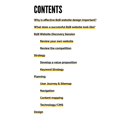
Because this is such a long piece of content, our users can choose which part of the blog they want to read via a navigation with anchor links - rather than being confronted with an overwhelming amount of text.
Lists are also great for SEO, as Google recognises where schema markup (or structured data) has been used for information like reviews, pricing and more.
2. Text equivalents for non-text content
The web accessibility guidelines state that all content that isn’t text (videos, images, animations) should have a text equivalent for users that can’t see or access it.
The most obvious reason for this is to aid those with visual or hearing impairments, however, content can become inaccessible due to a poor internet connection or older browsers. Adding text to accompany visual content is another easy way to enhance accessibility on your website, that you can do right now.
Add clear alt text to all images
Alternative text (alt text) is used to contextualise images in case users cannot view them. Many content management systems will allow you to add alt text in at the upload stage - so be sure you don’t miss it. In HubSpot it looks like this:
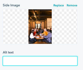
Some tips for writing good alt text include:
- Don’t write “image of” or “picture of” within your alt text
- Describe the most important aspects of the image within your alt text
- Don’t use the name of your image (e.g. Office shot 3) as your alt text
Having good alt text in place is essential for accessibility. Again, it doesn’t just help users with disabilities, but those who are in situations where their device or browser cannot view an image as you’ve intended it.
Use captions and transcripts for video and audio
If you use video or audio on your site, it’s essential that you also provide text equivalents that allow users to engage with the content in a different way.
Personally, I’ve lost count of how many times I’ve wanted to watch a video, but decided not to because I’m in a busy place and there’s no caption provided - and I suspect I’m not alone.
Captions and transcripts not only help people or hearing problems, but users who are in environments where they cannot currently listen to audio. Also, as hard as it might be to believe, not everyone likes video. By providing a text alternative, you cater for everyone.
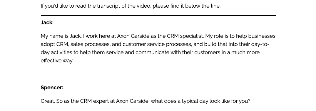
For example, in our A Day in the Life of an Inbound Agency video series, we provide thorough transcripts for those who can’t, or don’t want to watch the content. Take this example:
Top tip:
Providing transcripts for videos is also an excellent way to repurpose and generate more content. You can use a video as the base for one, or a series of blogs. This helps you make your website more accessible while offering a diverse range of content for different users.
3. CONTENT THAT ACTUALLY WORKS FOR YOUR USERS
Of course, ensuring websites are optimised for mobile has been a priority for B2B organisations for many years - yet there are still thousands of sites across the web that still don’t work effectively on devices besides desktops.
Even more common are sites that don’t work on older browsers - with a great deal of modern websites not working at all on outdated versions of Internet Explorer, and other alternative browsers. To be accessible, your site must be able to work on a range of devices and browsers with no issue.
Use resizable text
Most browsers and devices allow users to resize text if they need to, allowing those with visual difficulties to properly read and interpret content. But if your site isn’t built to support these features, a user resizing the text could make it difficult to interact with your content, or worse, break your site entirely.
Your site should be responsive to:
- the user’s device
- the page orientation
- the user's preferred font size
Best practice is to avoid specifying your text size using pixels, and turning off user scalability - these things risk breaking your site at worst, and frustrating users at best.
Features on your site should still be usable when text size is increased by 200%, and content should restructure into a single column when it’s increased by 400%.
Don’t force content on your users
Quite possibly the number one rule of accessibility is making sure your content actually works for your users, and a key part of this is actually not forcing users to engage with content where they don’t want to.
This might sound counterintuitive to your goals, however, forced content can actually send users away from your site - not help conversion. To avoid this, you should:
- not use autoplay content, or make it easy for users to pause and play any moving content
- not use blinking or flashing content where possible
- not rely on images or colour to indicate where content or links are
- only use micro-interactions (swiping, pinching) where necessary - not on important or legal content, for example
To be accessible, your site should cater for your users - which includes the things they DON’T want, as much as the things they do.
4. easily understandable content
Often in B2B organisations, there’s a misconception that using simple language means “dumbing down” the content.
Because many B2B companies are so accustomed to using industry jargon on a daily basis, they can become blind to the fact that their users may not necessarily be using the same language.
Of course, there are scenarios where your users will understand every word, such as in a highly specialised field. There are also instances where using complex language can’t really be avoided, such as in terms and conditions, or other legal content. Despite this, there is no reason that your content shouldn’t be straightforward and to the point.
Even in the most niche businesses, users still want to be spoken to in a way that resonates with them, while being easy to understand.
After all, no matter the intelligence level of your audience, no one wants to work overly hard to engage with and understand your content. If your content isn’t immediately understandable to your users, they’ll go elsewhere. It’s that simple.
So, take a look at your content, and see if it does the following.
- Uses plain English: are you overcomplicating simple concepts? Users can be easily put off by complex language as it can make them feel alienated, or like they are purposely being misled.
- Avoids long sentences: read your content - do you even have time to take a breath? Web content should be written clearly and concisely to avoid cognitive overload.
- Provides explanations for unfamiliar words: do you refer to concepts or ideas your user isn’t familiar with, and if so, do you explain them? As a rule of thumb, it’s fine to include complex language where you have to, as long as you provide an explanation.
Don’t fall into the B2B trap of thinking simplicity means less value. Unnecessary over-complications could be the reason why your users aren’t engaged.
5. A SOLID FOUNDATION FOR ACCESSIBILITY
Got this far and now concerned that your site can’t accommodate even the simplest changes?
If this is the case, it may be time to rethink your entire site. Web accessibility matters. For your users, your business, and for search engines - it isn’t going away anytime soon. The bottom line is if your site isn’t accessible in a world where users expect it, you’ll struggle to see the results you want.
Creating an accessible site that provides a great user experience begins with the design. And beyond accessibility, there are many other things you’ll need to consider when building the best experience for your users. There comes a time when your current site just won’t cut it anymore - and sometimes a few minor adjustments aren’t enough.


.png?width=115&height=183&name=sade%201%20(1).png)