

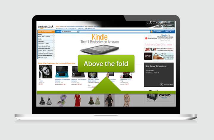
Historically, "above the fold" refers to the upper half of a newspaper's front page, where the top news story and photograph are typically located.
In terms of web development, it describes the portion of a webpage that is visible without scrolling. In the early years of the internet, people weren't accustomed to moving past it. It was within these 600 pixels of content nirvana that users would quickly decide whether or not they wanted to stay on a website.
But in 2021 is the concept of 'the fold' still relevant for B2B website design?
Over the years we've become more tech-savvy. The fold isn't what it used to be due to the huge variety of screen sizes and range of devices now in use. However, the issue is still relevant as desktops and laptops aren't going away anytime soon. At the same time, our browsing habits have become ingrained and we require fewer visual cues. We're fully accustomed to the concept of scroll and this was demonstrated when Apple removed the scroll bar from Mac OS X in 2011.
A study of popular celebrity news site TMZ found that the links at the bottom of its longest pages were often the most clicked on. This indicated users' willingness to scroll in the pursuit of great content and showed little correlation between scrolling behaviour and screen height if a user is engaged.
Designing specific content to be presented above the fold is becoming less relevant as user behaviour evolves and anyway, the screen size of the devices we use to browse the web now varies greatly. The natural instinct of users on tablets and smartphones is to swipe down. In fact, as of July 2021, a whopping 49.71% of the total web visits are mobile.
When desktop was the only internet-enabled device available, it was easy to create a consistent user experience. Now however, with multiple screen sizes to cater for, creating a uniform ‘above the fold’ experience is a lot more troublesome. A responsive design has no fixed layout, with content and website elements rearranging themselves to a screen of any size. Therefore, having a set ‘above the fold’ cut off point is an archaic design feature.
Instead, more emphasis needs to be placed on mobile website design and the behaviour of your visitors. For example, a mobile visitor is much more action-orientated and short on time. A desktop user on the other hand may be exploring your website at a much more leisurely pace, and has more information visible on the screen at once.
B2B website design no longer need to squeeze absolutely every piece of important information into the top of the page. A study with the Bristol Airport website revealed that visitors were less likely to scroll down when more information was crammed into this area.
Usability expert Jakob Nielsen’s eye-tracking studies show that although attention is naturally focused above the fold, the majority of people will intuitively scroll, especially if the page is designed to encourage it. In fact, in our own experience analysing heatmaps, we've found that many users instinctively scroll up and down pages naturally before even taking in the content above the fold.
TOP TIP: Try to reduce any blank space at the bottom of the 'fold' - having a large block of colour may lead some users to believe this is the end of your page. Where possible, always show that there is more content to be seen.
A well-populated content section in the fold indicates there is more to see
What about CTAs above 'the fold'?
While B2B website design has come along in leaps and bounds, as the ‘Principles of Persuasive Website Design’ highlights, content above the fold still captures 80% of attention.
Consider this – 96% of website visitors are not ready to buy when they first arrive on your site. As inbound marketing has shown us, prospects need to be nurtured with valuable content which can identify their pain before they are ready to proceed to the next stage in the buyer’s journey.
Simply having a CTA on it's own above the fold, therefore, has little impact to overall conversion rates. It is the quality and relevance of the supporting copy that positions your company as a worthy service provider, and makes a CTA click more likely. If a prospect has already read valuable content before viewing the CTA at any stage of a page, they are going to be a more qualified lead and subsequently are more likely to become a prospect in comparison to a visitor who has just arrived on your site.
The fold still exists, it's just not as vital as it was in the past.
So How can you encourage Users to Scroll Down?
- Use visual cues – While the majority of your website visitors will realise that your website is scrollable, some may need a little persuasion. Vertical lines, arrows and less subtle ‘read more’ icons help to catch your visitor’s eye, propelling them to read down.
- Remove clutter – If the top of your home page is stuffed with aggressive ads, visitors are likely to click straight off, frustrated by the lack of actual content. Furthermore, Google penalises sites that use these spammy tactics.
- Approach slideshows carefully – A visually stimulating slideshow can help to add an interesting edge to your web design. However, they can also detract visitors from the rest of your website. A slideshow that covers too much ground may suggest that there is little content on the rest of your page, distracting from your core CTA.
- Avoid too much blank space – A large block of empty space at the bottom of your fold suggests that this is the end of the page.
- Encourage exploration – For example, continuous animation that leads down the page helps to intrigue visitors, as well as leveraging copy and content to ensure each section of the page leads naturally to the next without being disjointed.
- Use relevant and enticing content throughout - Remember that not every user scrolls down the page in order, some people scroll back and forth between sections, so make sure that each section of your page contains relevant and quality content, and...
- Insert core CTAs where relevant, not just at the bottom and top - Due to many people's way of scrolling, only having CTAs at the bottom and top of a page could mean they are missed by some users or aren't used in their most effective position. Don't just spam CTAs everywhere, but carefully weave them throughout your content in a natural way.
what's the verdict?
Ultimately, scrolling down a website page is dependent on the user, the type of website they are visiting and whether or not the content is worth scrolling for. Displaying important content above the fold helps engage readers and give them insight and immediate feedback that the content and purpose of the page they've visited is in line with their expectations and needs. However, content above the fold should ideally be limited to only what is required to do this. Too much indeed info above the fold can easily turn users away.
From an end-user point of view, a visually focused layout is more appealing. A good mix of typography, images and interactive content will ensure people receive the necessary information to stay on a web page. When building your new B2B website, deploy visual clues to encourage scrolling, but don't overload your visitors' senses and risk them navigating away.
Key takeaways:
- With around half of website views coming from mobile devices, there is no long one 'fold'
- Users are now used to scrolling instinctively, so the very first content on the page isn't as vital as it used to be
- However, it's still very important from a UX perspective to make the top content of a page focussed and effective, to ensure your visitors see that the page aligns with their expectations and needs.
- In regards to conversion - the content above the 'fold' helps set up the users to convert lower down the page - however CTAs in, for example, a 'hero' module can also be effective as long as the supporting copy and design is effective in creating appeal and value.
- Use visual cues, coherent design and content to encourage users to scroll through your page.
Editor's note: This article was rewritten in October 2021 for accuracy.


.png?width=115&height=183&name=sade%201%20(1).png)